Colourways & final hero building sketch
3D modelling the Auction house -
To turn my sketch into a 3D model I first made a top down layout for the building, this helped me understand where i needed to place the objects from the reference image to the right hand side. I was originally going to make a full orthographic, but i really struggled to imagine how this building would look from different angles, by using the layout below as well as my sketch, i could fill in the blanks and approximate heights better than i would have been able to do with an orthographic sketch.

https://www.youtube.com/watch?v=n6tm7C7K0gA
And here is my model from all 4 angles, I screenshotted my model with the wireframe and shaded mode on so that i could draw over the blue lines much easier than if i was going off of just the shadows.
Colour Iterations -
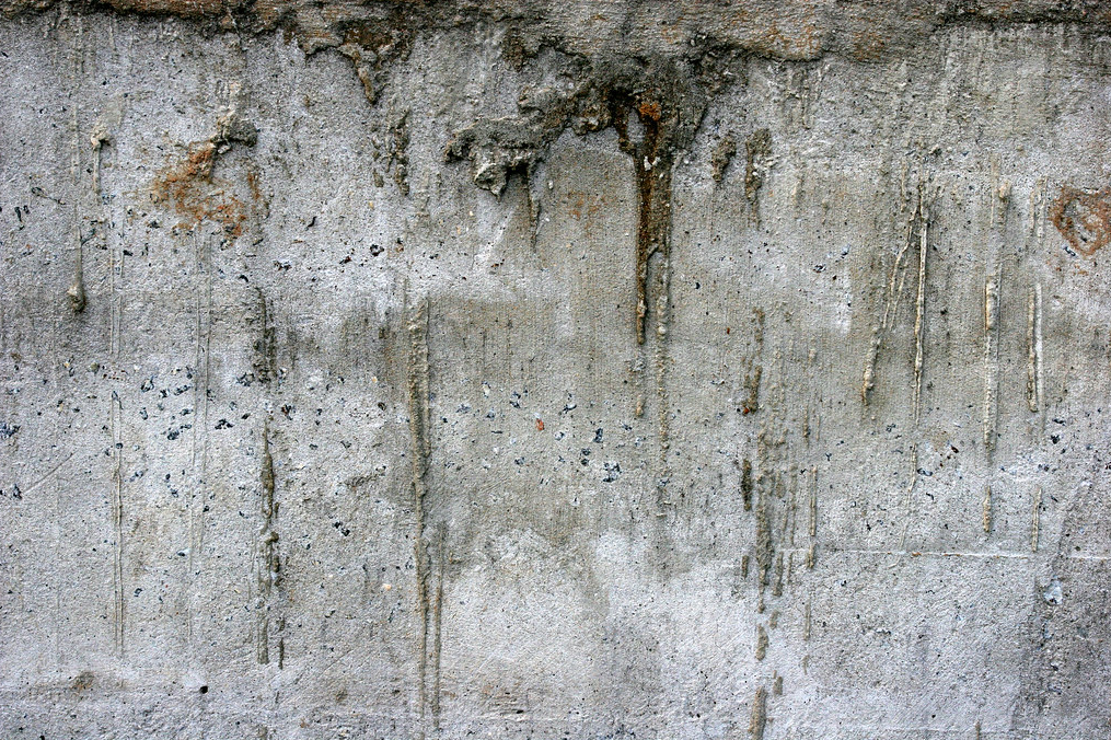
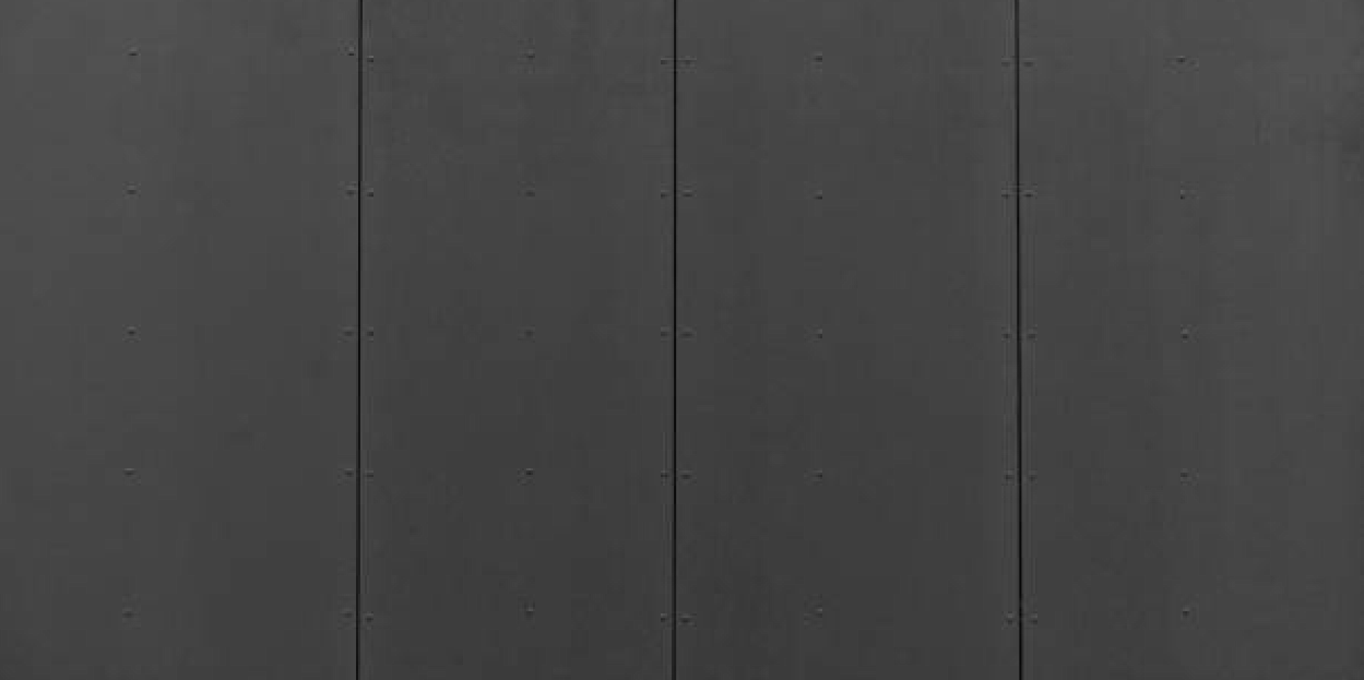
I then made some colour iterations once i had drawn over my model, I searched online and found 4 images of textures that i wanted to replicate, 2 versions of weathered concrete, and 2 versions of metal panelling. Both of these materials can be found in brutalist architecture and fit well with the theming of the marauders, i especially like the weathered look as it gives a very grim atmosphere to this building. At this stage i just added some very simple shading and texturing to the buildings so that i could get some feedback on what building looks best.

Below are the materials i took inspiration from, i colour picked hues from these images and tried to replicate the way the textures looked.

Feedback -
Presenting my designs to my peers, i got some feedback on which designs looked best based on the small brief i gave them:
Evil base for a faction of space orcs/goblins, something grimy and depressing.
Most of the feedback i got agreed that the top two choices fit best with a dingy feel to them, with the bottom two feeling too clean or neat to be read as an intimidating building. Design number 1 got the most votes by far, and i also agree that that one is my favourite. I agree with holly's comment that the contrast is the best with design number 1, its easy to see the different materials and areas of the building and to me looks the most eye catching. As this building is very important in the gameplay mechanics of the game [this building holding the final boss for this area] it is important that this building stands out and can be easily understood by the player.
Final hero building-
Here is my final hero building design with annotations explaining the different areas of the model. I also included a small height scale [using my Sphyr character as reference] just to put in perspective how big this building would be. I also added a back view as this structure would be placed in the center of the cargo yard and the player would be able to walk around it, therefore it is important to show off this building from both angles so no details are hidden. This reflects back to the feedback i got on my thumbnails and how someone commented how this design was nice, but felt like there was information that was missing to what the back would look like. I agreed and i am glad i added this back view as this would likely be where the boss would emerge from. I'm also happy with the little detail of the gate as this would stop the player from entering this area before the right time.


Comments
Post a Comment