Compositional shots -
Using the 3D model i had made, I took some compositional shots from different angles. I tried to capture as many of my key models [cargo containers, main building, wall and watchtower] in the piece as possible whilst also making the scene feel believable and getting a good balance of areas of detail and rest. below are some notes on my thoughts on each compositional shot.
.png) |
| Looking at this one, it is a bit cluttered and their is no real main focus, especially not on my hero building. I think the lights could be utilized to make some leading lines and draw focus to an element in the scene however from this angle they act more as clutter than visual aids to draw the viewer's eye. I really want either the hero building to be the centre of focus, or the layout of the map, this composition really doesn't seem to be achieving either in my eyes. |
.png) |
| I did quite like this composition, as stated before i think the lights in this piece do act as leading lines to the main building, there are some interesting elements in the background such as the watchtower and truck parking, however i feel this composition is lacking interest or any sort of dynamic details, its very flat and uninteresting. |
.png) |
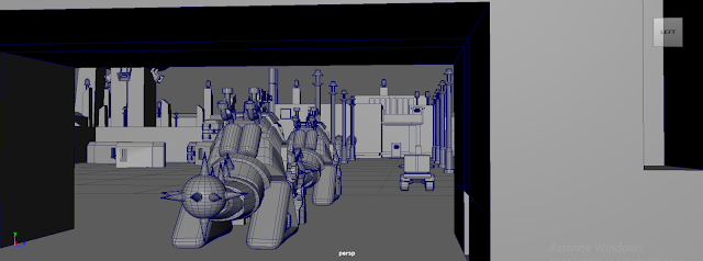
| This was another piece i really liked, i think the buildings coming together to create an empty space in which the jeep and watchtower is framed is really nice compositionally. It utilizes the rule of thirds and areas of rest and detail, however i feel my hero building blends into the architecture and the main focus is being placed on the jeep and the tower instead. This is one that i might consider, and that i might just refocus my hero building to the watchtower. A brief takeaway from this is that taller buildings generally will be more eye-catching than shorter ones, and if i wanted to make a hero building in the future i should remember hierarchies and that generally the biggest object in the scene will draw the most attention. |
.png) |
| I really really like this composition, I think it is visually interesting and dynamic, being placed at a higher angles allowing more of the landscape to be seen. It brings focus to my hero building and i think for the main purpose of my art piece being to show off this area before the player enters it, i think this composition does a very good job at this. The only issue i foresee and this is what the feedback i got reiterates, is this might be a bit challenging to draw. But, i am open to this challenge and I want to give it a go, It's something I've never really done before but i would like to do this sort of environment paint overs again in the future so i think just getting stuck in, trusting the process and watching how some professionals work will help me learn something new. |
.png) |
| This composition is almost like the last, but just generally a bit weaker in terms of its focus and dynamic elements, and so i think much like the second compositional shot it feels very flat and boring. Though this might be a good middle option if the previous shot proves to be too difficult. |
.png) |
| I liked the idea of this scene, and i think theres a good concept there but the angle and zoom on this piece feels a bit too removed to be interesting. We don't get to see much of the hero building and generally i don't feel enveloped in the scene. |
.png) |
| Building from the last one, i think this piece does a much better job of putting you into the environment, the lower angle implies the viewer is stood on the ground, my hero building is front and center, led into by the streetlamps and the vehicles heading forward. Although i do really like this piece, I don't think it shows off many of the models i made for this half of the project so i think it would be best to go with a better layout. |
Feedback -
I did originally start working on layout number two, but quickly found it to be visually uninteresting and i felt i could do something much cooler with another composition. I asked some of my peers and my tutor which layout they liked best, and they agreed that layout 4 could be really cool and atmospheric. As you can see in this piece i started drawing line art, which my tutor advised me to skip and just go straight into adding in colour, this isnt a process i am used to however Sam advised me to look at artist Feng Zhu and how he draws in a similar lineless and intuitive style. I have watched quite a few of Feng Zhu's school of design videos and i really like how he draws environments, I think taking some tips off of how he does his art would help out in showing me how to tackle something like this and i am certainly happy to try something new. I don't feel sad about scrapping this sketch either as i know i can do something better and sometimes an idea just isnt right and you have to try something new.
.png)
.png)
.png)
.png)
.png)
.png)
.png)


Comments
Post a Comment