Personal work
Here is some of my personal work from over this year using techniques learnt in class-

Date completed - 27/10/2024
This is a piece of one of my characters that I used the referencing tip for, I have found that finding that curvature of the legs really helps me draw the shapes more accurately. I did neaten up some of my sketch but I only used the image on the left hand side as reference. I also used contrapposto on the shoulders and hips to infer the movement of him looking over his shoulder. I do think I could have pushed the tilt of the head forward more to better match the reference however.
This is the piece finished, I am really happy with this piece and I found the referencing tip very helpful. I have stepped away from my usual style in some respects for this drawing, it has been something I have been working on in my own time to vary my shading art general art style techniques. I didnt use the airbrush tool [except for the blush on his face] and opted for a cell shading style, I like the harsher shadows and lighting in this and I think in some places it almost gives it a hazy and somewhat foggy atmosphere. This fits well with the setting as he is sitting inside of a cavern made of flesh. Background wise I think i should try to work with more organic shapes for this setting, which will help me practice different and varied shapes in perspective.

Date completed - 02/11/2024
This drawing is a lineless piece of one of my friend's pony characters, I like to make artwork for all of my dnd campaigns as a way to show some of the locations that my game visits, this location being the in universe version of the hoover dam. I also try to give each of my campaign artworks a different art style, for example the previous piece on this blow has a cell shaded and line art style and this one is solely lineless. I was very inspired by an artist called AstroEden who did the artwork for one of my favourite bands called Vylet pony, they have a somewhat lineless and very colourful art style.
Here is the final piece, i used the gradient tool for the water as well as flipping some of the background pieces to create reflections in the water, which i was very happy with. I think to improve this piece i could have moved the subject further right into the canvas just to frame them a little better and make the composition more pleasing to look at.

Date completed - 02/11/2024
Using the same method i was able to make two more drawings , i find this art style is very quick to make drawings with, the most time consuming part is mostly just the sketch layer.

Date completed - 02/11/2024
Of the three drawings i made, this one is my favourite. I really like the lighting and background in this and i think the colours work well with the subjects in the foreground. To improve on this i might go in and neaten up some more of my shading just to help some of the shapes read a little better especially around the yellow horses back hooves.

Date completed - 08/11/2024
This is a drawing based on a screenshot i took from the opening for the anime Dan Da Dan, I really liked the composition and colours of this frame and i thought i would have a go at replicating it in my own style. I first made the sketch which was quite difficult to get the woman's [subject on the right] head to look right at this angle so that it looked like she is resting it on the mans shoulder so i did have to retry this several times. Once i was happy with the sketch and line art i coloured in my drawing in just the normal colours for these two characters.


Date completed - 27/11/2024
For this drawing I tried to use some of the tips we covered in the values lesson, throughout this piece i frequently switched between my colour view and a greyscale view to check how my values looked, and considered my light sources. The main light source in this piece is the big window behind the subjects, with the atmospheric lighting being the lamp and perhaps the small light from the incense on top of the cabinet. I also tried out a new rendering method for this piece, i tried to give it a more painterly feel by using the marker brush to make more textures and a smoother gradient between the colours.

Date completed - 24/12/2024
This drawing originally just started out as a sketch i did for fun, without really any direction or inspiration on how i wanted it to go, but in the end i actually ended up with a sketch that looked somewhat interesting and i thought would look cool as a finished product. I used some of my knowledge from the hand drawing exercises from earlier in the year and tried to play around with perspective and foreshortening to get a more interesting and dynamic composition, it took a bit of jigging around to get it to how i wanted it to look, but i did try to limit my overall use of the -


Date completed - 01/01/2025
Similar to what i did in the previous piece, this was more of an exercise to see how my knowledge of anatomy is with minimal reference. I tried to work somewhat gesturally at first to get the pose to look dynamic and figure out roughly where the limbs should go, i then blocked out the muscle groups and spent a bit of time refining the overall shape and pose details until i was happy with it. i wanted the character to be holding a gun on his back, this gun is the Pit multitool by Trevor Roberts, i just cropped the picture so that i would be able to draw on top of it. I do intend on making a 3D model of this in the future as i draw this character a lot and using my own 3D model would make it much easier to draw this prop from a range of different angles. After i was happy, i then drew in my lineart and coloured it in. Also like the previous piece, the background is a drawing i had done previously that i didn't really like by itself, i did the background around about two days prior and i generally just didn't like the style i had drawn it in, so i thought using it as a backdrop would mean i hadn't wasted my time.

It is ok to make mistakes, that is how you learn.

Date completed - 29/12/2024
Here is the original image, this is a redraw of a piece i did roughly two years ago as i feel i have a better understanding of perspective and composition compared to when i first drew this. Sadly i just really didnt like the colours and texture on this piece and ended up not seeing it through to completion, i also feel the falls look much smaller than they looked in the original piece, this is just something that didnt work out and that's ok, i will learn from my mistakes and maybe try this piece again in the future.


Date completed - 05/01/2025


This map is more zoomed in and focuses more on the places of interest like the clubs, dam, statue and the hotels that the players might enter. this is just one area of a larger map and serves to be useful for developing ideas for lore in just a small area of the map.
And here is the map i made for the Sahara project.


Date completed - 11/01/2025
Here is a spaceship i drew based on a thumbnail sketch one of my friend's made, I was thinking about what areas i struggle a lot in and thought i should do some artwork in those areas to get my confidence up a little bit. A tool i used to help me in this piece is first making a model of my subject in Maya, then drawing over it so that my perspective and proportion is correct, i found this method was both much less stressful but also twice as useful as now i have a 3D reference for my subject meaning i can draw it from any angle much easier, and also texture it for 3D practice.


Date completed - 11/01/2025
Here is the freighter ship with the smaller transport ship for size reference.

 |
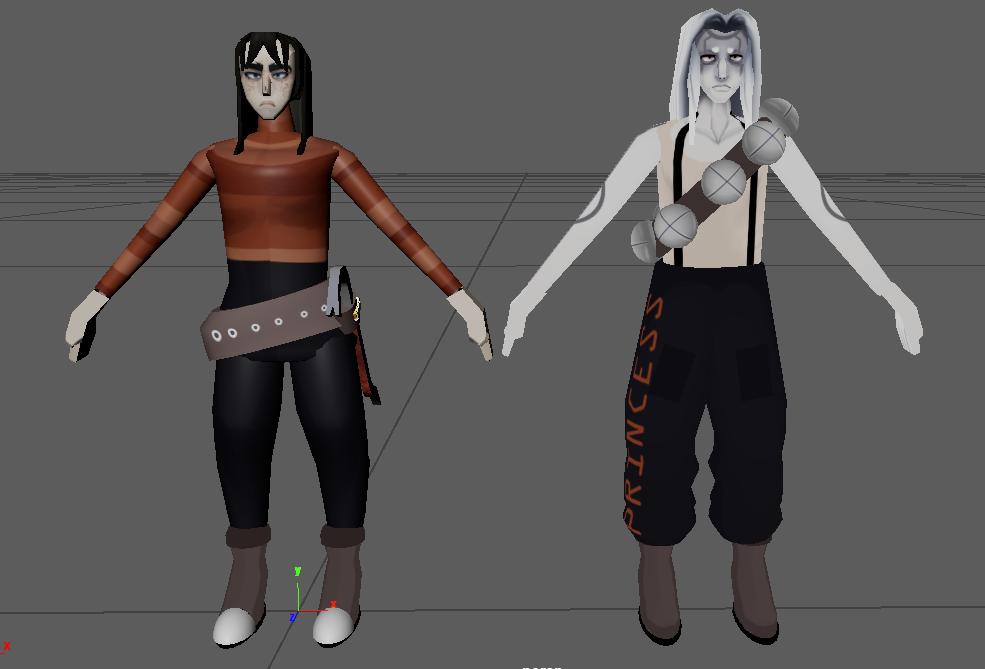
To practice some 3D modelling skills i decided to make two of my Dnd characters as models in the style of the characters in the game Mouthwashing. I used the character Anya as a reference and was able to find an orthographic of her model to help me replicate the style with my own characters. For the most part the bodies are consisted of cylinders and the hair being extruded cubes. I used the mirror tool quite a bit to make sure elements stayed symmetrical across the body. I still really struggled with the UV mapping and i think you can tell this with some of the obvious seams going down the character's torso and under the eyes, but other than that i am very proud of these models. I have been trying to figure out rigging and weight painting with these characters for a few weeks now, i still don't fully understand what i'm doing so i might return to this when i have a little more time. Something i am very proud of with these models is the hair and how i constructed it.
 |
Here is the character i was inspired by :)
ttps://mouthwashing.fandom.com/wiki/Anya/Gallery?file=Anyamodel.png

Date completed - 26/02/2025
Similar to my drawing of the spaceships i created a few months ago, i utilized the 3D blockout technique again for this piece. I created the 3D model of the vehicle based on an orthographic image of the VEEV on the mystery flesh pit website, this allowed me to have a better understanding of how this unique vehicle would look from this angle. I used the rule of thirds to frame both of the subject in the scene though i feel i could have made this effect stronger by altering the size of the monster in comparison the the figure in the foreground.


Date completed - 18/04/2025
I decided to do another piece to practice drawing in grayscale as well as working with backgrounds, the line art that you can see is the sketch layer that i roughly drew on top of using my values, I also used some atmospheric perspective for the trees in the far distance as well as used fog and contrast to separate the darker subjects in the foreground from the lighter background. I was aiming to go for a very moody piece so kept the lighting quite dark, with the main light source behind the subject, the slight light that does illuminate them comes from the reflections in the water.
Date completed - 21/04/2025
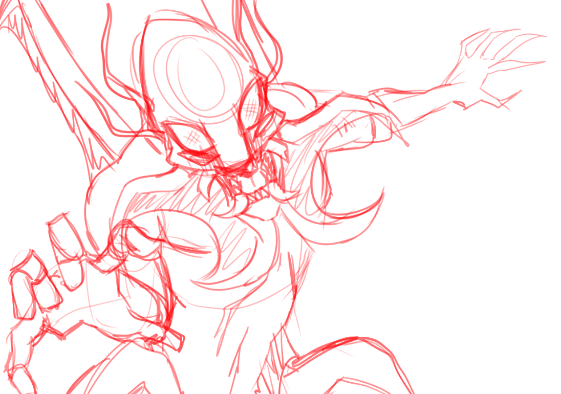
For this piece I had the idea of creating a character for my science fiction project where his muscles are exposed due to a sort of genetic mutation. Aside from this being a cool lore note, I thought this would be a good opportunity to practice the muscular structures as this is something i struggle with quite a bit. It is to note that the hands and head being left as usual is a stylistic choice due to the backstory of the character. With the pose i tried to look at both the builds of bodybuilders as well as viewing musculature structure references, this was necessary as i wanted my character to have accurate muscle structures whilst retaining an interesting pose that you might see a bodybuilder holding. I then blocked out the muscle groups and put in slight indicators to where the muscle fibers will be running. From here i drew in the details as usual in my marker brush. I then decided to colour the portions of the line art that cover the muscles in red to really define the shift between skin and meat, i don't usually do this in my art but decided to give it a go to try something new.

I then used a purple multiply layer to place in the shadows. I also used a lighter red with the marker brush to better define the fascia in the centre chest region, where the pectorals connect under the deltoids, near the elbow, and along the obliques and patella region. I had a bit of trouble figuring out the muscles in the feet, though i tried to get it as close as i could to being accurate. For the face i was given some advice to darken the area around his nose and under eyes to give a more sunken in and gaunt expression which fits with the nature of this character, he has been through a lot of physical trauma with his muscles bursting through his skin, and so he shows a lot of his pain through his expression. I think i could definitely improve this drawing especially with the muscles in the arms and lower legs, but overall i am really happy with this drawing and honestly this was a really cool idea to draw out.


Comments
Post a Comment